Sprezzatura on the Rail
Walk into a good shop in Milan or Florence and the first thing you notice is what is missing. There is less on the rail than you expected, and more room around each piece, and the effect is not modesty. It is a pricing decision.
Sprezzatura is usually translated as studied carelessness, the art of looking as though no effort was involved. On a shop floor it stops being a personality trait and becomes a layout: fewer garments, wider spacing, one strong texture at eye level and nothing competing with it.
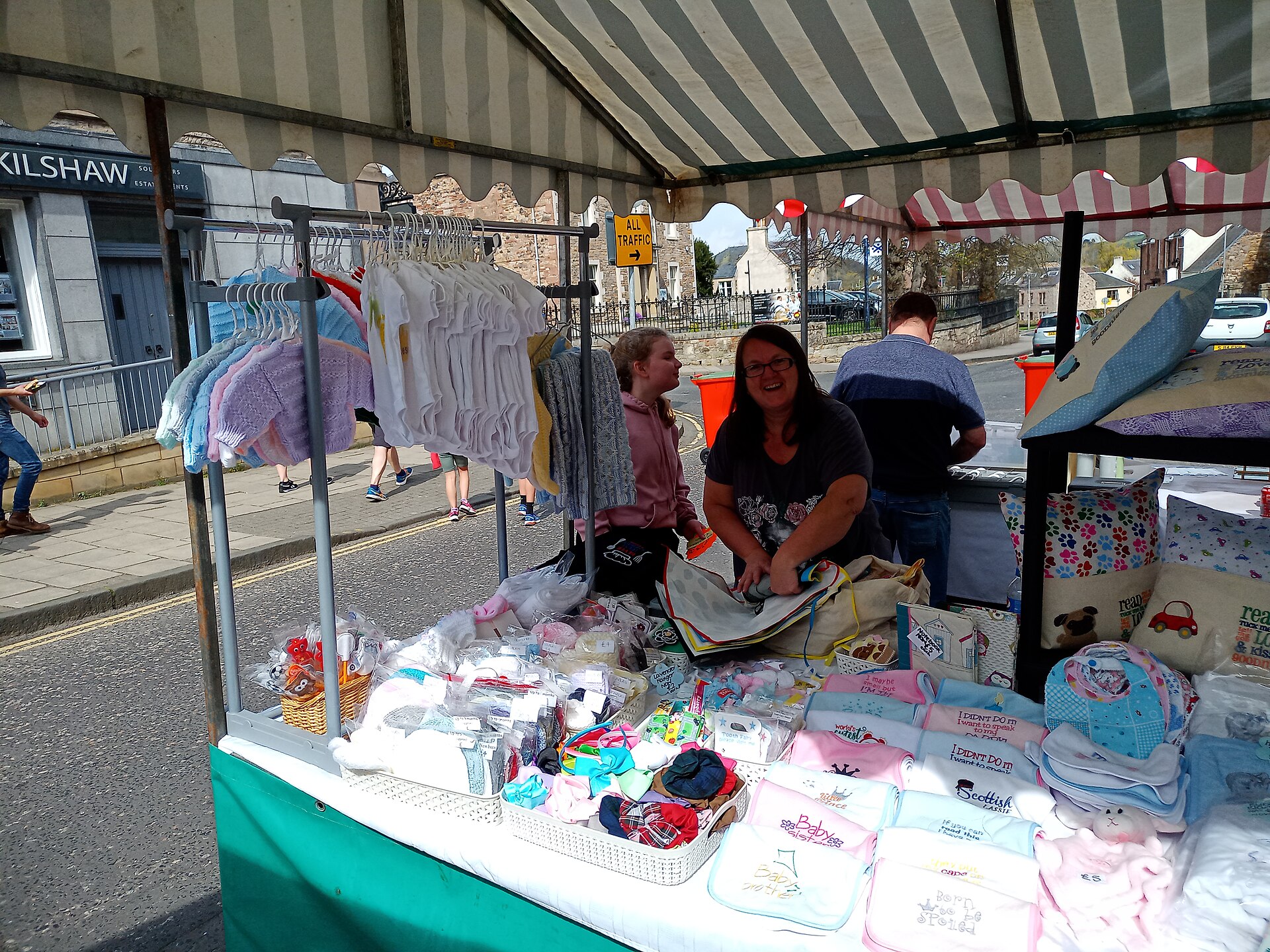
The commercial logic is unglamorous. A densely packed rail invites comparison, and comparison shopping settles on price. A sparse rail invites examination, and examination settles on cloth and cut. You are choosing which question the customer asks before they touch anything.
Texture carries the weight that logo used to. A boucle, a heavy piqué, a brushed wool reads at three metres in a way a printed chest mark no longer does. Put the tactile piece where the eye lands and the ordinary pieces around it start to look considered rather than filler.
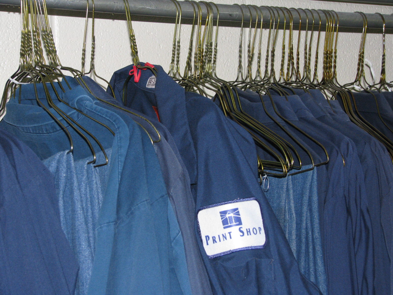
Colour discipline does the rest. Two or three families per rail, with one accent, so the assortment looks intentional. This is also a buying instruction, not only a display one. It is very hard to merchandise calmly out of an assortment that was bought greedily.
The part most shops get wrong is depth. Space on the floor only works if the stockroom is deep, otherwise the sparse rail is simply an empty one and the customer reads it as a shop going out of business. Fewer styles bought properly beats more styles bought thinly, which is the same argument in a different room.
None of this requires an Italian address. It requires deciding that the rail is an argument rather than a container, and buying an assortment that can survive being spaced out.